Recurse Center: Week 4
If you want the rainbow, you’ve got to put up with the rain
Last week I got a lot of educational value out of motoring through Nand 2 Tetris Part 1, but at the end of the week I noticed that the intensity of working solo through it had left me feeling somewhat isolated. Knowing too that working on a self-directed project can lead to bigger learning payoffs, as you learn to plot your own way through a fog of uncertainty without the guardrails of a curriculum, I decided to pivot to something else for a little bit.
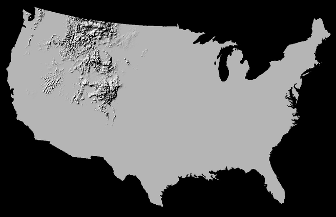
I happened to have seen a visualisation of annual US snowfall that tickled my brain and thought maybe I could do something similar. The UK has experienced an increase in severe downpours in recent years, linked to climate change, and I thought it might be interesting to compare similar animations of rainfall across different time periods to communicate this.
“Was this enough of a challenge?” I wondered to myself, since the author of the snowfall work even documented their code to produce it, and I know that a plethora of powerful graphics libraries exist. Why not just try and whip something together I thought, and then I can always look at extending it or move on to something else.
It turns that lack of challenge was not the issue; quite the reverse. I was able to find data from the UK’s Centre for Environmental Data Analysis easily enough, but reading it and turning it into something usable has turned out to be another matter.
The files are in a scientific data format called NetCDF. The first thing I wanted to do was just open one and see what was inside. Could I open it in a text editor? No, it is in some sort of binary format. Can I find a viewer to open the files? The first one I try tells me the file is invalid. Maybe because the format has existed since 1990 and there are different versions? I manage to open it on another tool and feel a rush of excitement…. until I see this.
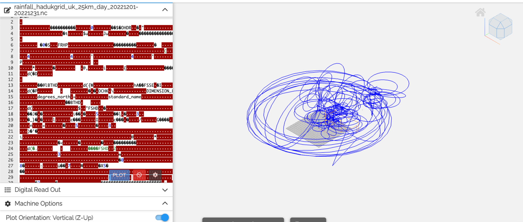
Is it possible that the UK’s scientific agencies are actually just run by toddlers with a pack of biros, and noone has noticed until now? Probably not (but I’m not ruling it out).
At some point one fellow recurser pointed me to another, Jake Low, who has a lot of experience in visualisation and mapping. We hopped on a quick call for me to explain what I was trying to do and he gave me some useful suggestions about things I’d need to consider and some tools I might find handy.
Some blood, sweat, and tears later I manage to sort of get something working, but was stuck on three things:

- I wasn’t yet summing the data cumulatively across time and was running into trouble trying to do this
- I didn’t understand how the greyscale of the .tif files I was producing was being calculated - did it think that >= 1mm of rain should correspond to a 100% white pixel? If so, this is going to become a very boring animation very quickly
- I had originally downloaded low resolution data because I thought it would be easier to handle smaller inputs, and then substitute the finer grained version once I had the process up and running - more on this below
And I haven’t really got unstuck yet. I’ve been through what feels like a hundred iterations of different approaches, and whenever one thing starts working, something else falls apart. The problem is that these data formats and tools are immensely complex and powerful, but I don’t have the time (interest?) to sit down and really get to grips with everything. The documentation for the main R package I’ve ended up using runs to 250 pages, and yet every single piece I read seems to assume vast amounts of prior knowledge, and omit every detail that I want explained. Different tools show different things when you peak at the data, and there is a lot of different teminology (is one time point of data a ’layer’? A ‘band’? A ‘dimension’? Are these always equivalent or does it depend on the context?)
At some point around here I find myself feeling nostalgic for the simplicity of a JSON structure, and appreciative of the wild abundance of Javascript learning materials on the internet. How do climate scientists get anything done? I suppose they spend years learning the tools of their trade, and benefit from working with fellow experts.
To add insult to injury, when I went back to download the high resolution data from CEDA’s website I got a constant stream of HTTP 500 errors, and still do. I tracked down their ftp server which they said the data could also be downloaded from and a set of credentials (easier said than done)… and then found a sea of folders and files with impenetrable acronyms for names, none of which resembled what I was looking for. I set off an automated search looking for the keyword of the dataset I wanted. Over half an hour later, nothing.

So much for thinking this might be too easy 🥲.
There comes a point where the value you are getting from the struggle is negligible and you are just slowly losing the will to live. Is it best to power through and find a way to bring some form of output to fruition, or should you recognise a sunk cost fallacy and refocus your energy somewhere more productive? I think I’m not ready to fully write it off yet, but what I do need to do this week (and probably should have done earlier) is actively pair with someone else on this to get a fresh perspective. Even just articulating the problems you’re encountering out loud has an uncanny ability to make you suddenly see the answer - hence the popularity of ‘rubber ducking’. And luckily, I am surrounded by people from all kinds of backgrounds who are not only excellent engineers but kind and generous collaborators.
Rays of light through the clouds
The week didn’t only consist of my self esteem sapping away with every misconfigured .tif pixel. I also launched into a Kubertnetes tutorial and enjoyed this week’s Missing Semester of CS workshop in which we discussed Vim, its steep learning curve and why devotees love it so much. When we managed to select a block of text in visual mode and rearrange lines by piping it as a range to the sort command we erupted into raucous cheers and the last sceptics were convinced.

Roll on week 5!